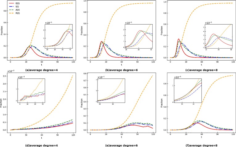
Fig. 2.
Time evolution of E(t), I(t), A(t) and R(t). The red solid line, blue dotted-dashed line, green dashed line, and orange dashed line represent the fraction of the exposed, symptomatically infected, asymptomatically infected, and removed individuals, respectively. Take human awareness into account in the bottom Panel and not in the top Panel. In Panels (a), (d), the network average degree = 4, which represents sparsely populated city; In Panels (b), (c), the network average degree = 6, which represents normal size city; In Panels (c), (f), the network average degree = 8, which represents densely populated city. (For interpretation of the references to colour in this figure legend, the reader is referred to the web version of this article.)

