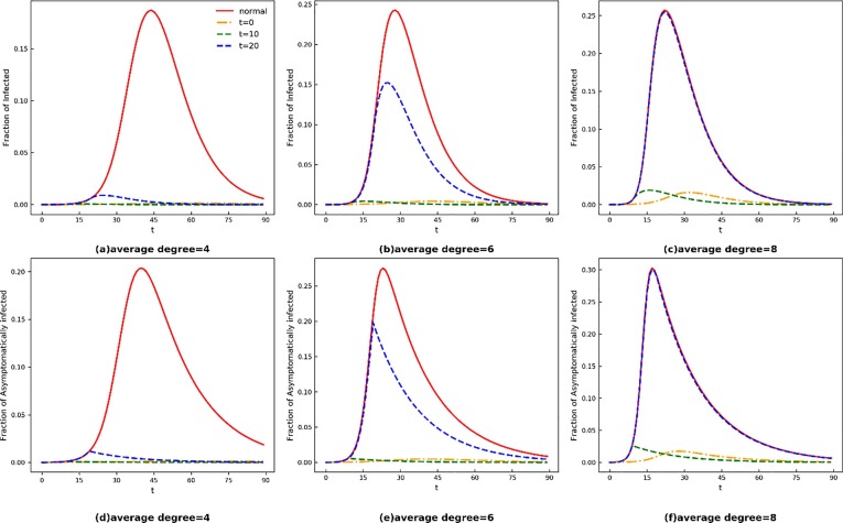
Fig. 4.
Time evolution of I(t), A(t) under different measures. The top Panel and bottom Panel indicate the fraction of symptomatically infected and asymptomatically infected, respectively. The red solid line shows the normal development of the epidemic, while blue dotted-dashed line, green dashed line and orange dashed line represent development under the measures of isolating communities when t = 0,10,20 respectively. In Panels (a), (d), the network average degree = 4, which represents sparsely populated city; In Panels (b), (e), the network average degree = 6, which represents normal size city; In Panels (c), (f), the network average degree = 8, which represents densely populated city. (For interpretation of the references to colour in this figure legend, the reader is referred to the web version of this article.)

