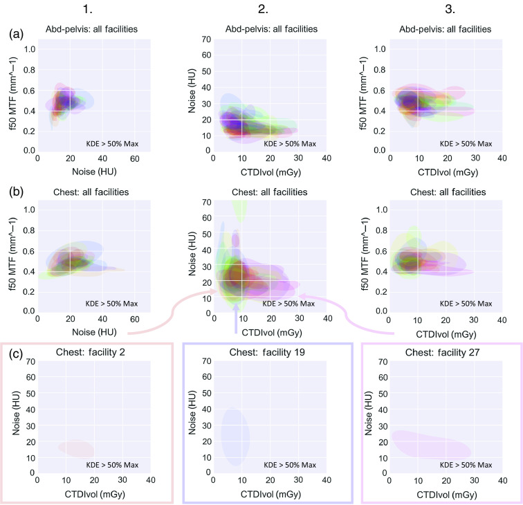
Fig. 2.
Relationships between image quality and dose at each facility (differentiated by color) for (a) abdomen-pelvic exams and (b) chest exams. (c) A carve-out of the regions of three sample facilities for the noise versus dose plot [(b), column 2). In all columns and (a)–(c), each color area represents the range of likely values for a facility via Gaussian KDE. Displayed are the contour areas of 50% of max of the KDE (this used to estimate probability density function) regions for noise, resolution, or dose. Variability in the imaging enterprise shows itself in two ways: (1) interfacility variability is demonstrated by the different locations of each of the colored regions and (2) higher intrafacility variability is demonstrated by those regions that encompass a greater area (and thus less consistent image quality/dose values). Each of three example facilities in (c) exhibits a different amount of intrafacility variability in image quality and dose (denoted by their areas), as well as interfacility variability between them (denoted by their locations).

