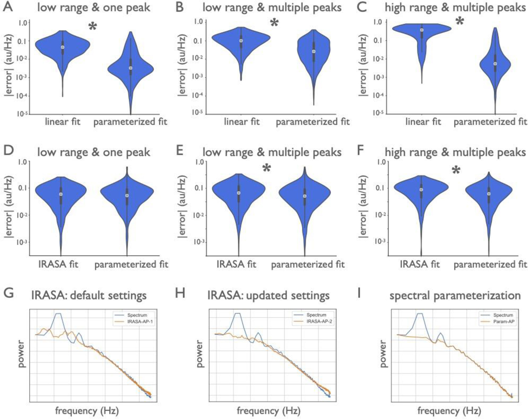
Extended Data Figure 5 |. Methods comparison of measures of the aperiodic exponent.
(A-C) Comparisons of spectral parameterization to a linear fit (in log-log space), as used in BOSC47, on simulated power spectra (1000 per comparison). (A) Comparison of a linear fit and spectral parameterization on a low frequency range (2–40 Hz) with one peak. (B) Comparison across the same range with multiple (3) peaks (C) Comparison across a broader frequency range (1–150 Hz) with two peaks and an aperiodic knee. In all cases (A-C), spectral parameterization outperforms the linear fit. (D-F) Comparisons of spectral parameterization to IRASA48. Groups of simulations mirror those used in (A-C). Note that for these simulations, the data were simulated as time series (1000 per comparison) (see Methods). IRASA and spectral parameterization are comparable for the one peak cases (D), but spectral parameterization is significantly better in the other cases (E,F). Note that as IRASA has both greater absolute error and a systematic estimation bias (see Supplemental Modeling Note). (G-I) Example of IRASA and spectral parameterization applied to real data. (G) The IRASA-decomposed aperiodic component, using default settings, in orange, is compared to the original spectrum, in blue. There are still visible non-aperiodic peaks, meaning IRASA did not fully separate out the periodic and aperiodic components. (H) The IRASA-decomposed aperiodic component, with increased resampling. This helps remove the peaks, but also increasingly distorts the aperiodic component, especially at the higher frequencies, due to its multi-fractal properties (the presence of a knee). (I) The isolated aperiodic component from spectral parameterization (computed as the peak-removed spectrum), showing parameterization can account for concomitant large peaks and knees, providing a better fit to the data. All violin plots show full distributions, where small white dots represent median values and small box plots show median, first and third quartiles, and ranges. Note that the error axis is log scaled in (A-F). * indicates a significant difference in between the distributions of errors between methods (paired samples t-tests). Discussion of these methods and results are reported in the Supplemental Modeling Note.

