
FIGURE 2:
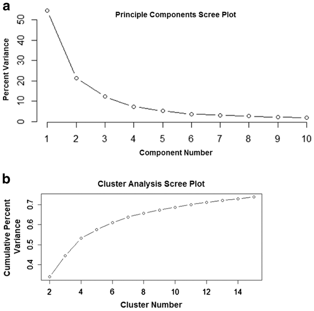
Scree plots for the PCA and cluster analysis. Panel A depicts the percent of total variance explained in the Fort Jackson dataset by each principle component. The vertical axis represents the percent of the variance and the horizontal axis is the principle component number. Panel B is the percent of total variance in the Fort Jackson dataset that is explained with the addition of each cluster. The vertical axis represents the cumulative percent of the variance explained and the horizontal axis is the cluster number.