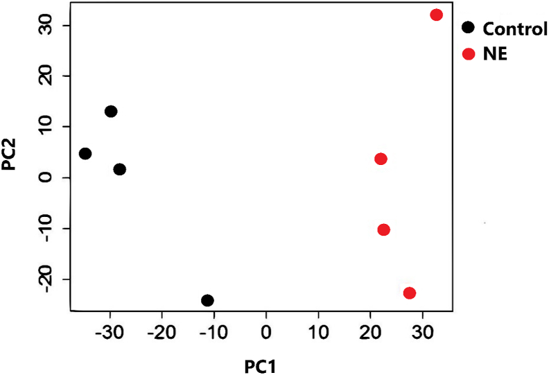
Fig. 2.
Principal component analysis plot of differentially abundant transcripts. The plot shows log2 counts per million mapped reads (CPM) for both groups. The horizontal and vertical axes show 2 principal components that respectively explain variation between different groups. Control, non-challenged birds (black); NE, necrotic enteritis challenged birds (red); PC1, the axis showing the first principal direction along which the samples show the largest variation; PC2, the axis showing the second most important direction which is orthogonal to the PC1 axis.

