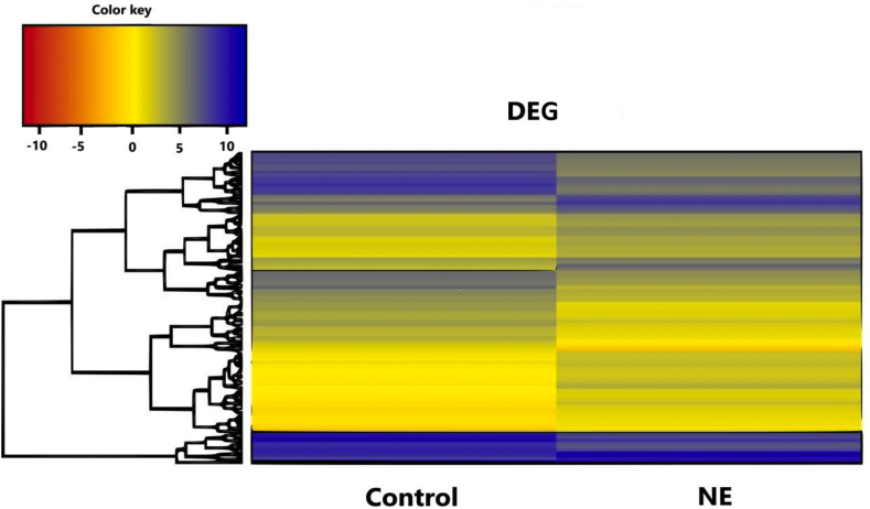
Fig. 3.
Heat map showing the top 100 differentially expressed genes (DEG). Each horizontal row represents a single gene, and each column represents 1 of the 2 experimental groups. Colors indicate a positive (blue) or negative (red) fold-change. The log2 counts per million mapped reads (CPM) values were used to cluster all the presented differentially expressed genes in Java TreeView by hierarchical clustering using Euclidean distance and pairwise average linkage methods.

