Figure 4.
The distribution of actin polarity at FAs
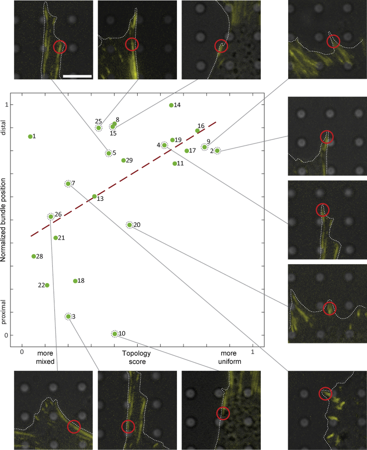
Plot of topology score versus normalized bundle position along an FA. The green datapoints (fitted by the red dashed regression line) suggest a correlation between these two parameters. The polarity distribution along FAs transitions smoothly from mixed to uniform. Some datapoints in the plot are accompanied by their fluorescence microscopy signal. The plasma membrane is outlined by white dashed lines, and the tomogram position is indicated by a red circle. Scale bar, 5 μm.

