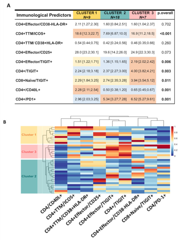
Fig 4. Immunological predictors identified by penalized regression could separate the cohort into 3 distinct clusters.
A) Table summarizing the 3 clusters identified by Ward’s Minimum Variance Clustering Method. Number of participants assigned in each cluster is reported in the first row. Median and interquartile ranges of the frequencies of the immune markers are indicated within every cell and were compared among the 3 clusters (P value is reported in the far-right column). Frequencies are color coded from higher (Red) to lower (Blue). P value was calculated using Mann-Whitney U test. B) Graphical representation of the frequencies of the predictors by heatmap graph. Each column shows the frequency of one predictor identified by the label at the bottom while each row show the frequency of the predictors in one participant.

