
Figure 3.
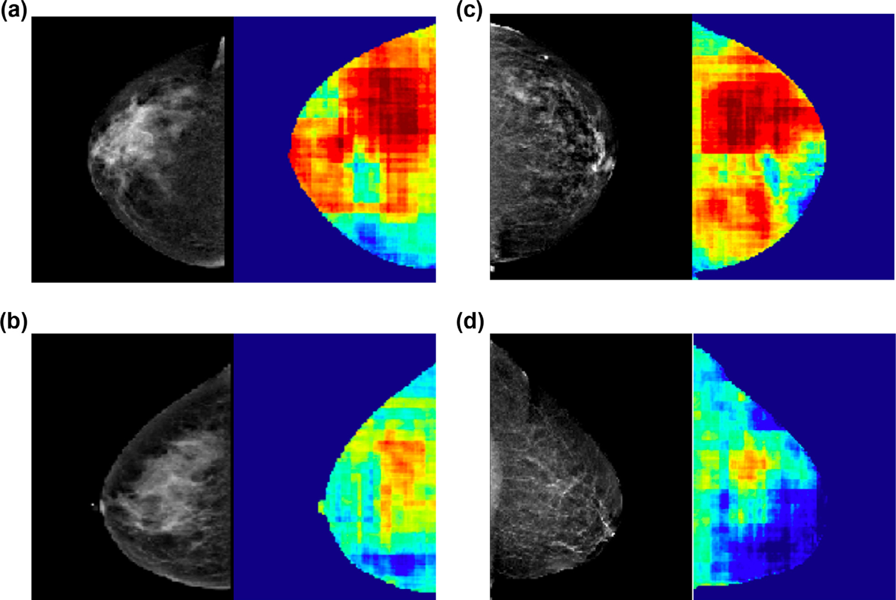
Pixel-wise heat maps. Heat maps generated by color-coding the final softmax scores on a pixel-wise basis, demonstrating subregions within the mammogram that are most commonly encountered in normal (blue) and high cancer risk (red) patients. Mammograms in (A) and (B) illustrate similar breast densities (heterogeneously dense) and mammograms in (C) and (D) illustrate similar breast densities (scattered) but the corresponding heat maps are different with patient A with significantly higher mammographic regions containing red and correctly identifying high risk. Similarly, patient C with significantly higher mammographic regions containing red and correctly identifying high risk.