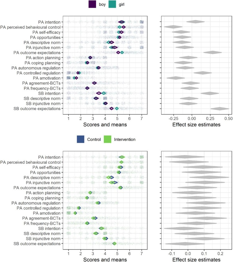
Figure 3.
Diamond comparison plot drawn with R package ufs (Peters (2019), code available at https://git.io/fjLBB), showing means (middle of diamonds), 99% confidence intervals (endpoints of diamonds) and individual answers (dots) separated by gender and arm. Rightmost plots show heuristic effect sizes for differences in means (transformed to Pearson’s r). ICC is not accounted for in any plot.

