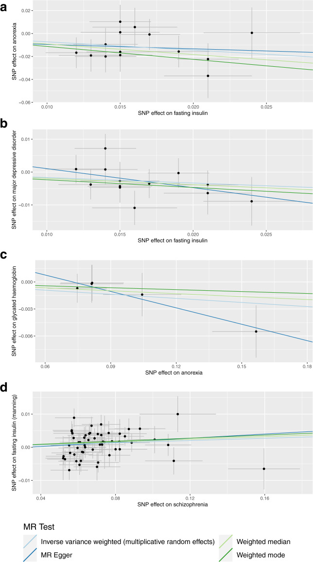
Fig. 2. Sensitivity analyses of causal estimates.
The scatterplots represent the IV effects on the exposure and outcome variables (black point), with the confidence intervals for both estimates denoted by the horizontal and vertical lines, respectively. Each coloured slope is indicative of the causal effect of a unit increase in the exposure on the outcome, estimated by the method in the legend utilised to shade the trendline – that is, inverse-variance weighted effect with multiplicative random effects (light blue), weighted median (light green), weighted mode (dark green), and MR-Egger (dark blue). The four panels correspond to a different exposure-outcome pair: (a) fasting insulin → anorexia nervosa, (b) fasting insulin → major depressive disorder, (c) anorexia nervosa → HbA1c, and (d) schizophrenia → fasting insulin.

