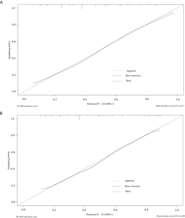
Figure 4.
Calibration curve of the model in the training cohorts (A) and validation cohorts (B). The diagonal dashed line represents the ideal prediction by the perfect nomogram; the solid line represents the calibration estimate from internally validated model; the dotted line indicates the apparent predictive accuracy. The closer the solid line is to the dotted line, the stronger the predictive ability of the model.

