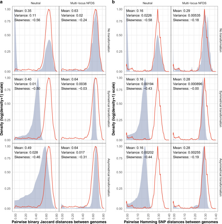
Fig. 3. Density plots comparing the distribution of pairwise genetic distances between isolates in the genome data and at the final timepoint of simulations.
Each panel shows data from a different model parameterisation. The red outline shows the distribution calculated from the genomic data (N = 189,420). The blue shading and displayed statistics in each panel describe the overall distribution of a random 2% sample of the equivalent distances calculated from the final timepoint of 100 replicate simulations (overall N ≅ 378,840). a Pairwise binary Jaccard distances calculated from isolates’ accessory loci compared with the distribution calculated from the genomic data (mean: 0.63, variance: 0.015, skewness: −0.22). b Pairwise Hamming distances calculated from single-nucleotide polymorphisms compared with the distribution calculated from the genomic data (mean: 0.29, variance: 0.0043, skewness: −0.13).

