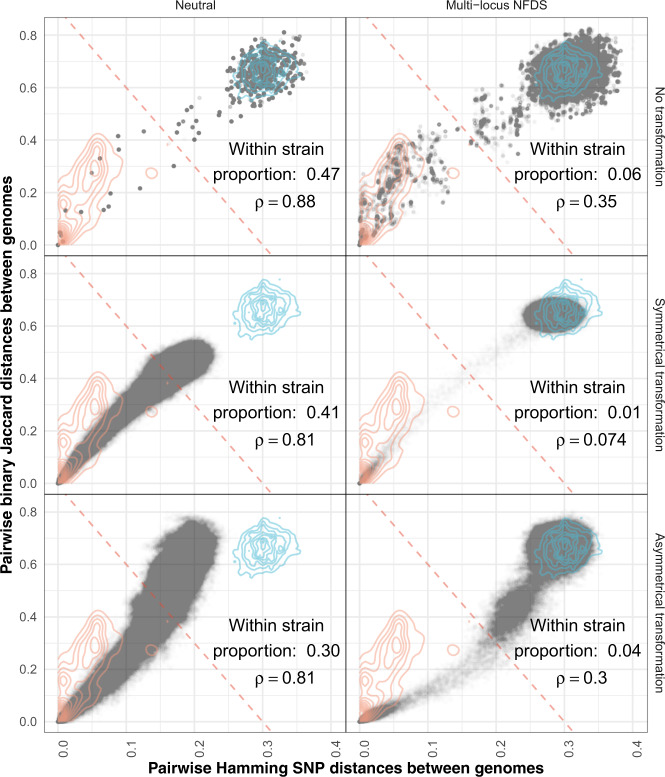
Fig. 4. Scatterplots comparing the distributions of pairwise genetic distances between isolates at the final timepoint of simulations.
Each panel combines the data from the equivalent panels in Fig. 3 (N ≅ 378,840). Each point is a single comparison between isolates, with the horizontal axis representing divergence in core genome single-nucleotide polymorphisms, and the vertical axis representing divergence in accessory loci. The red diagonal is a threshold distinguishing within- and between-strain distances (Fig. S36). The contours describe the distribution of within- and between-strain pairwise distances in the genomic data (orange and blue lines, respectively; N = 189,420). The proportion of pairwise comparisons classified as within-strain, based on the displayed threshold (0.06 in the genomic data), and Spearman’s correlation statistic (ρ; 0.38 in the genomic data) are shown in each panel; all correlation p values were <10−10.

