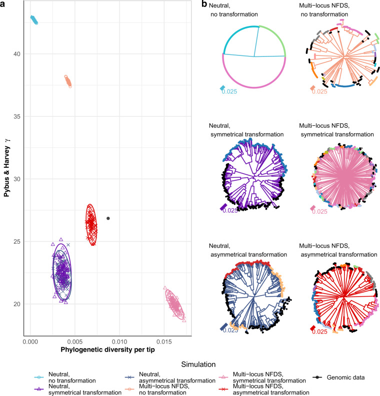
Fig. 6. Comparison of trees between the genomic data (Fig. S50) and simulation outputs.
a Scatterplot comparing the characteristics of the neighbour-joining tree calculated from the core single nucleotide polymorphisms (S = 1090) in the genomic data (black point) and those from the final timepoints of 100 replicate simulations for each of six different model parameterisations. The horizontal axis quantifies the variation in the population as phylogenetic diversity (sum of branch lengths) per tip (N = 616). The vertical axis quantifies the branching pattern as Pybus and Harvey’s ɣ. Point shapes and colours represent simulation types. Ellipses describe the distribution of each set of points. b Representative trees corresponding to individual simulations from each parameter set. The branch colours indicate the simulation type, and the tip colours correspond to their original strain assignation in the genomic data. Strains that were rare in the genomic data were merged into a single category, which is marked by black tips.

