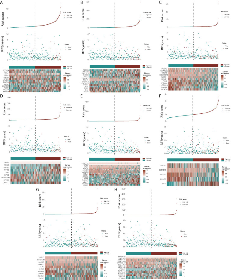
Figure 3.
Construction of AS model and distributions. (A–H) represents the AS events AA, AD, AP, AT, ES, ME, RI, and total events, respectively. In each figure, the top section shows patient survival data sorted according to the risk levels, the middle section shows the risk score distribution curve, and the bottom section shows the differences in levels of identified hub immune signatures between high-risk and low-risk groups as a heatmap plot.

