
FIGURE 6. Sector-wise MBF Correlation and Bland-Altman Plot.
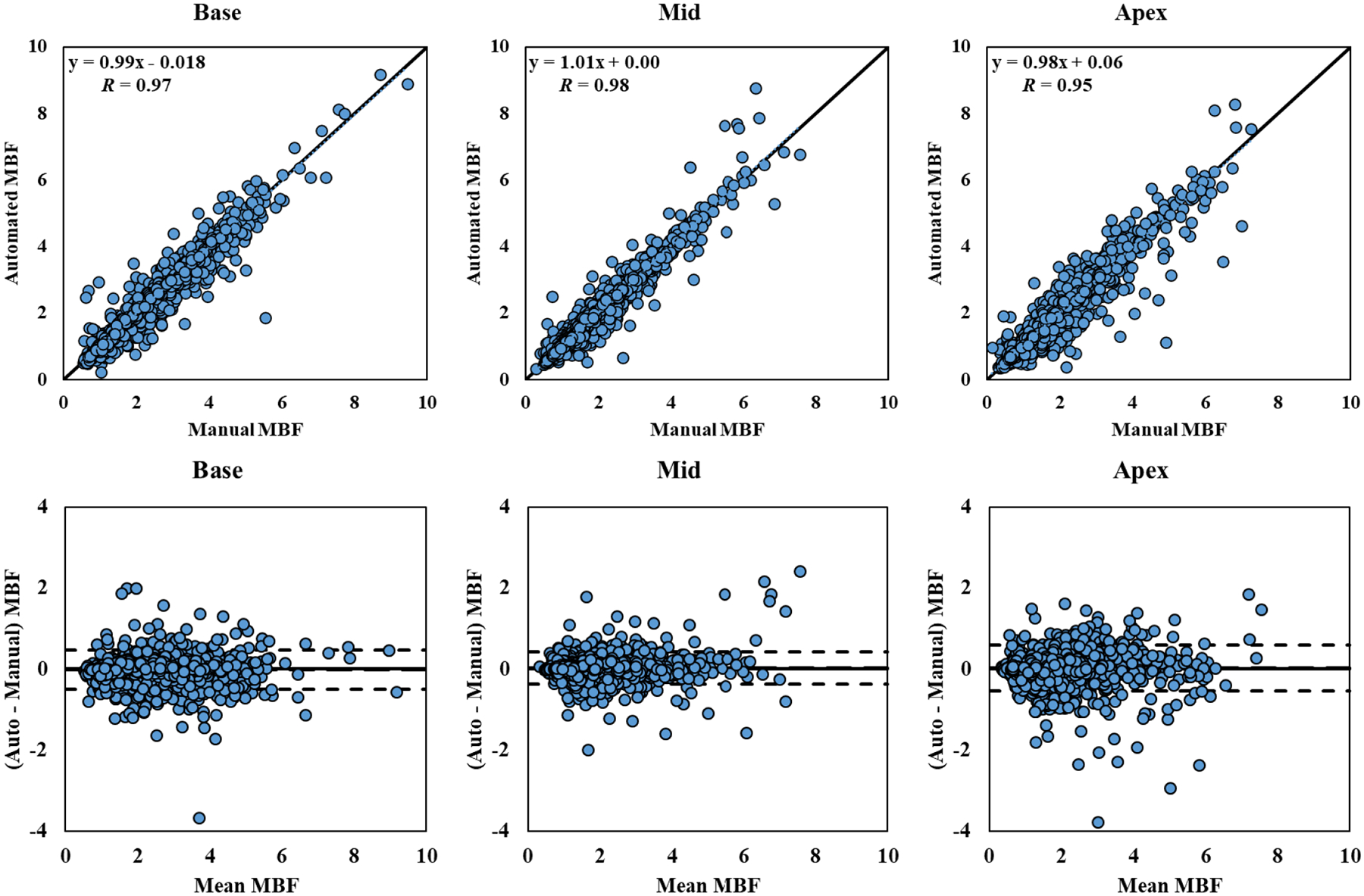
Correlation and Bland-Altman plots of automatic and manual sector-wise MBF values (in ml/g/min) for the 243 studies processed, separated by different slice locations. The dotted blue lines in the first row represent the trend of linear regression. The dashed lines in the second row represent the bias (automated – manual) and limits of agreement (mean ± 1.96 SD).