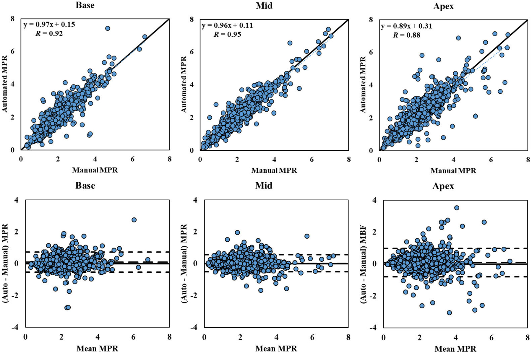
FIGURE 7. Sector-wise MPR Correlation Plot and Bland-Altman Plot.

Correlation and Bland-Altman plots of automatic and manual sector-wise MPR values for the 243 studies processed, separated by different slice locations. The dotted lines represent the trend of linear regression. The dashed lines represent the bias (automated – manual) and limits of agreement (mean ± 1.96 SD).
