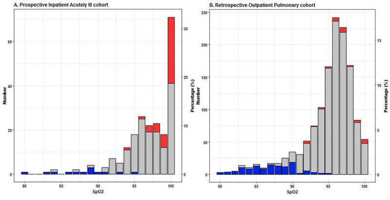
Fig 4. Stacked bar plots of the number and percentage of PaO2 values at every SpO2 value.

A. Prospective Inpatient Acutely ill cohort (PIA cohort) and B. Retrospective Outpatient Pulmonary cohort (ROP cohort). The left y-axis represents the number of data points and the right y-axis represents the percentage of data points per SpO2 value of the total number of measurements in the whole cohort. PaO2 values are divided into three groups: < 60 mmHg (blue), 60–125 mmHg (gray) and > 125 mmHg (red).
