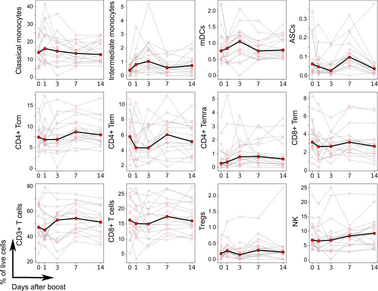
Figure 3. Frequency of cell types altered by vaccination as determined by CyTOF.
Each plot represents the frequency of a given cell type in terms of percentage of live PBMC (y axis) as a function of the time after booster vaccination (x axis), as determined by high-dimensional automated gated analysis of data generated by CyTOF. Data are expressed as connected time points from day 0 to days 1, 3, 7, and 14 after booster vaccination for each individual donor (thin lines) and the median of all (bold line). A total of 18 participants was evaluated (n = 18), and 21 cell types were evaluated. Only cell types that showed a significant difference in frequencies over time are shown, based on a paired, nonparametric Wilcoxon test (P < 0.05).

