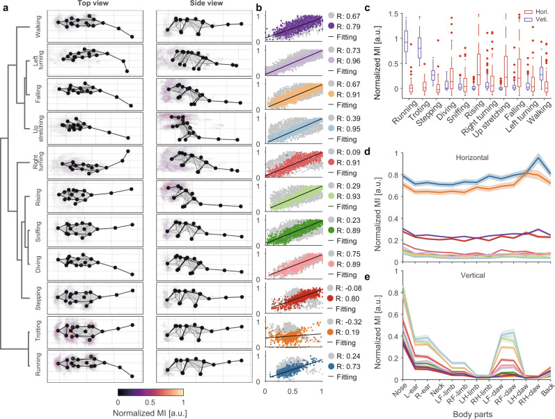
Fig. 5. Visualization and quantification of behavioral kinematics.
a Average skeleton of all frames within each movement phenotype. The skeletons are shown with solid lines and calculated by averaging poses of body parts across time. The heatmaps overlaid on the average skeleton are the distribution and movement intensity (MI; see Supplementary Information for further details) corresponding to each movement phenotype. The MIs are scaled with 0–1 normalization method and shown in arbitrary unit (a.u.). b Correlation and linear regression plot of movement phenotypes. The horizontal axis represents the target, and the vertical axis represents the reference (see Supplementary Information for further details). The color-coded and gray dots correspond to the intra- and inter-cluster correlation coefficients, respectively. c The comparison of MI between different movement phenotypes. Each movement segment has two MI components (red boxes, horizontal; blue boxes, vertical). The boxes’ values for each group contain the MIs of n behavioral modules (n is the number of behavioral modules of each group). In box plots, the lower and upper edges of the box are the 25th and 75th percentiles of the MIs, the central marks indicate the median, the whiskers extend to the most extreme data points not considered outliers, and the outliers are plotted individually using the dot symbol. d, e Horizontal and vertical MI of each body part in different movement phenotypes. The values on each line are the MIs of all behavior modules corresponding to the phenotype, shown by body parts separately and presented as mean ± standard deviation (SD). Source data are provided as a Source Data file.

