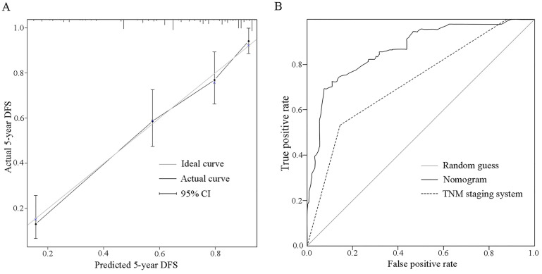
Figure 6.
Calibration plot and ROC curve of the nomogram. A. On the calibration plot, the grey line represents an ideal evaluation, whereas the black line represents the performance of the nomogram, which showed favorable agreement between the predicted rate and actual rate. B. On the ROC curve, AUC of the nomogram (0.870 (95% CI: 0.823-0.917)) is greater than the TNM staging system (0.723 (95% CI: 0.657-0.790)).

