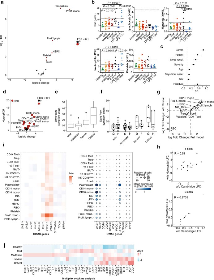
Extended Data Fig. 2. Differential abundance analysis and expression of GWAS hits related to cytokines, chemokines and growth factors.
a, Volcano plots showing differential abundance testing performed using quasi-likelihood F-test comparing healthy controls to cases for linear trends across disease severity groups. Differentially abundant cell types were determined using a 10% false discovery rate (FDR). b, Scatter plots showing blood counts for Newcastle data grouped by severity status (n = 6 healthy and LPS samples; n = 11 mild, n = 17 moderate, n = 7 severe, and n = 7 critical biologically independent samples). Dotted lines mark the normal ranges. Significance determined using Kruskal-Wallis with Dunn’s post hoc corrected for multiple comparison. WBC, whole blood count. c, Forest plot showing the standard deviation of each clinical/technical factor estimated by the Poisson generalised linear mixed model. Error bars show the standard error estimated from the Fisher information matrix (n = 130 biologically independent samples) SD, standard deviation. d, Volcano plots showing differential abundance testing according to time since symptom onset. Differentially abundant (FDR 10%) points are shown in red. e, Box plots displaying the duration of COVID-19 symptoms from the onset by severity (n = 23 mild, n = 30 moderate, n = 11, severe, n = 10 critical biologically independent samples). Boxes denote IQR with median shown as horizontal bars. Whiskers extend to 1.5x the IQR; outliers are shown as individual points. f, Box plots displaying the duration of COVID-19 symptoms from the onset split by severity and sex (n = 23 mild, n = 30 moderate, n = 11, severe, n = 10 critical biologically independent samples). Boxes denote IQR with median shown as horizontal bars. Whiskers extend to 1.5x the IQR; outliers are shown as individual points. g, Correlated log fold-changes of cell type abundance changes as a function of symptom duration with (x-axis) and without critically ill patients (y-axis). h, Differential abundance testing with a leave-one-out analysis for the T cells (top) of B cells (bottom) (FDR10%). i, Heat map displaying fold change over healthy (left) and dot plot of gene expression where the colour is scaled by mean expression and the dot size is proportional to the percent of the population expressing the gene (right) for genes associated with COVID-19 identified in recent GWAS studies18,19 for the cell populations in Fig. 1b. j, Heat map displaying normalised values of cytokine, chemokine and growth factors in serum of patients with COVID-19.

