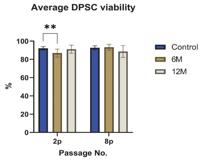
Figure 3.
The average DPSC viability of all cell groups evaluated in the 2nd and 8th passages. The graph presents the percentage of viable cells. Data are presented as a mean and SD plotted as error bars. The statistical analysis was performed between fresh samples and cryopreserved samples using one-way ANOVA, followed by Dunnett’s multiple comparison test (** p < 0.01).

