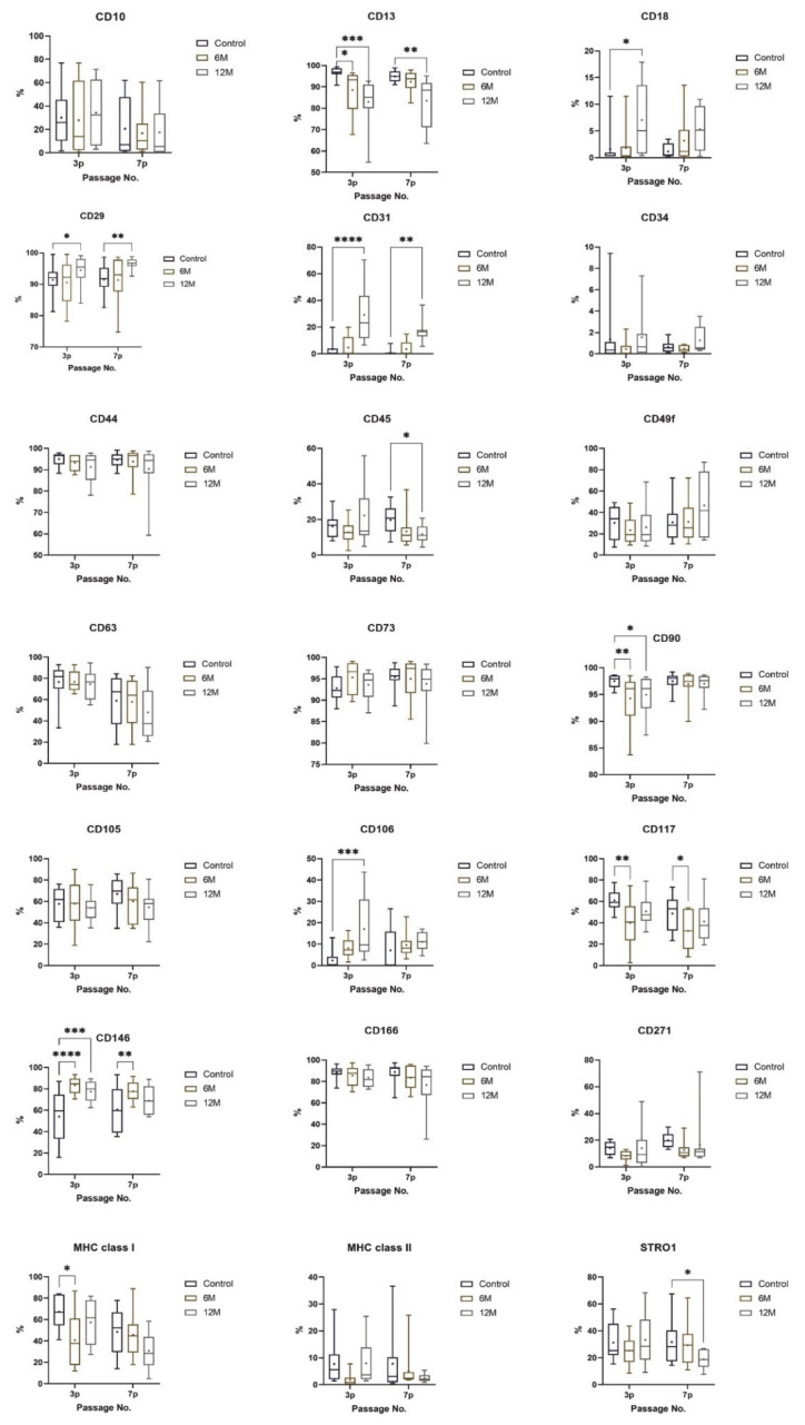
Figure 6.
Phenotype profile of all cell group analyses in the 3rd and 7th passages. The layouts of graphs illustrate percentages of positive cells, determined as the percentage with a fluorescence intensity greater than 99.5% of the negative isotype immunoglobulin control. Data are presented as a median, with boxes and whiskers representing the interquartile range and 5th–95th percentiles. The mean is shown as ‘+.’ The statistical comparison was performed between fresh samples and cryopreserved samples using Friedman’s test, followed by Dunn’s multiple comparison test (* p < 0.05), (** p < 0.01), (*** p < 0.001), (**** p < 0.0001).

