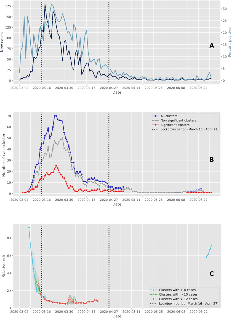
Fig. 1.
Evolution of cases and clusters through time. The vertical dashed lines delimit the Swiss lockdown period (March 16 to April 27). (A) Epidemic trajectory of positive tests. The daily new confirmed cases are represented in dark blue and the percent of positive tests are represented in light blue. (B) Number of case clusters over time. The total number of clusters detected daily by space-time scan statistics are represented in dark blue, and the red and grey lines represent the proportion of significant clusters (p ≤ 0.05) and non-significant clusters (p > 0.05), respectively. (C) Average relative risk of significant space-time clusters (p ≤ 0.05) over time according to within-cluster cases. (For interpretation of the references to color in this figure legend, the reader is referred to the web version of this article.)

