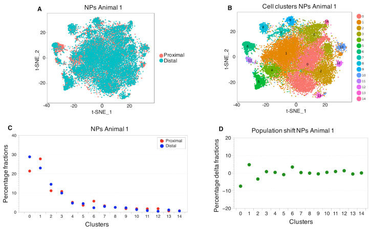
Figure 3.
Cell cluster distributions between proximal and distal NPs.The first t-SNE plot (A) provides a visual measure for similarity for the proximal and distal NPs. The graphical overlap stands for the amount of similarity in gene expression profiles of the distal and proximal NPs. The second t-SNE plot (B) shows the identified cell clusters. (C) The population sized within a cell cluster. The first dot plot (C) is a representation of the percentage of the fractions of cells per cluster, normalized to the total amount of cells in each corresponding sample (see Table S1 for the original data). The population shift observed between the proximal and the distal samples, is described in terms of number of cells that compose a cluster in each sample. (D) The difference in percentage between the cell cluster sizes of the proximal and distal NPs, indicating the amount of correlation between the samples. (Animal 2, in Figure S2 and Table S3).

