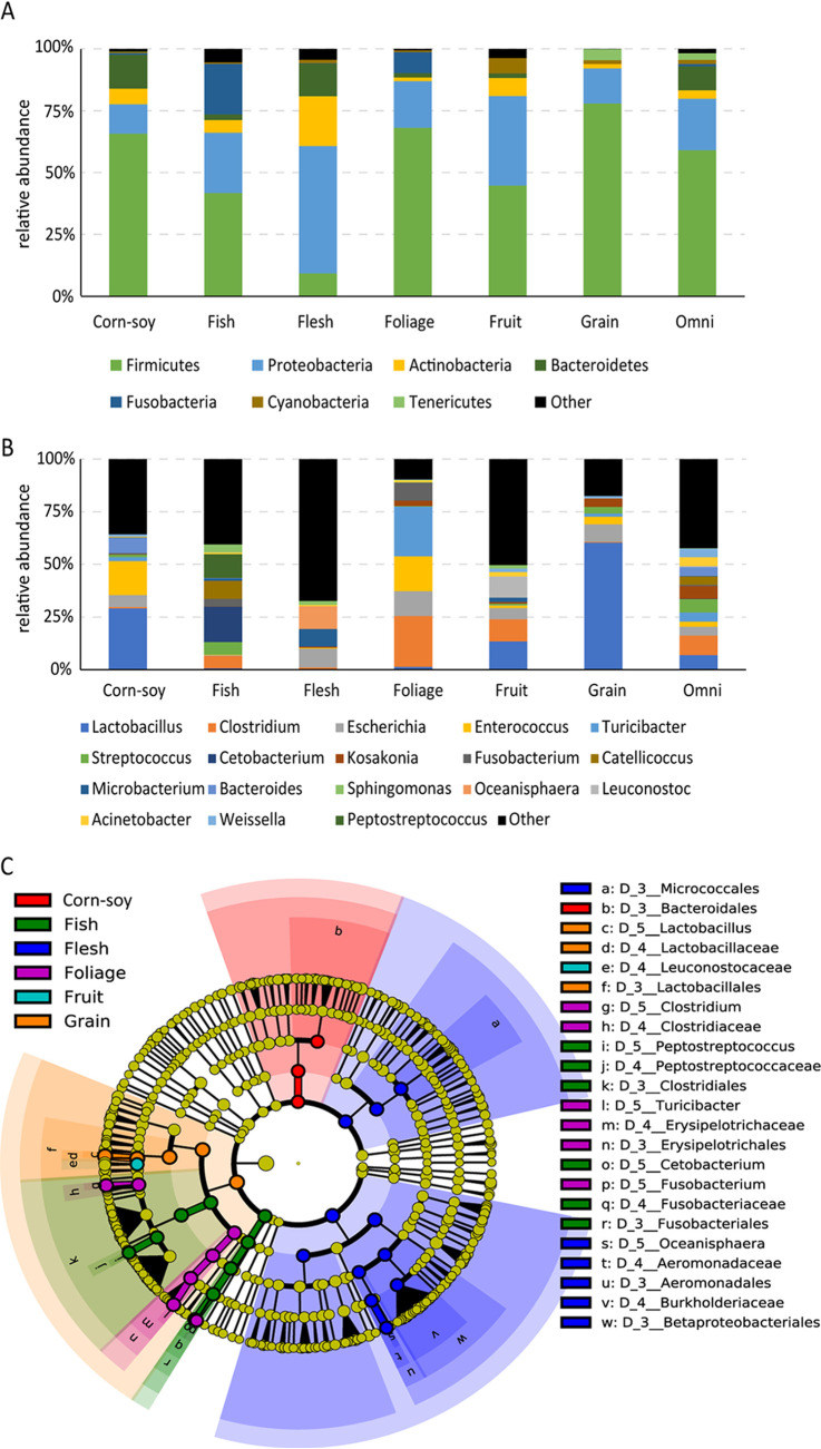
FIG 2.
Microbial composition in the different dietary groups. (A and B) The bar plot shows taxa with average relative abundances higher than 1% at the phylum level (A) and the genus level (B). Remaining species are classified as other. (C) LEfSe analysis. Cladogram showing the differences in relative abundance of taxa at five levels between the 7 dietary groups. Plot showing the taxonomic levels represented by rings with phyla in the outermost ring and genera in the innermost ring. Circles with nonyellow color indicate that there is a significant difference in the relative abundance at the different taxon levels (Wilcoxon rank sum test, P < 0.01; LDA score > 4), and yellow circles indicate nonsignificant differences.

