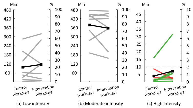
Figure 8.
Time spent at (a) low intensity, i.e., <25%HRR (heart rate reserve), (b) moderate intensity, i.e., ≥25–<60%HRR, and (c) high intensity, i.e., ≥60%HRR during ‘control’ and ‘intervention’ workdays (n = 8). ‘Control’ workdays consisted of performing work as usual; ‘intervention’ workdays consisted of performing modified work. The right y-axis shows the percentage time spent in each intensity during work; the left y-axis shows the corresponding number of minutes. Grey lines illustrate individual workers’ results for low and moderate intensity. In the high intensity panel, green lines illustrate workers already having a ‘just right’ distribution, or changing towards it. Red lines illustrate workers not having a ‘just right’ distribution, and moving away from it. Black lines show group mean. The grey dashed line indicate the ‘just right’ amount of 10 min of high intensity.

