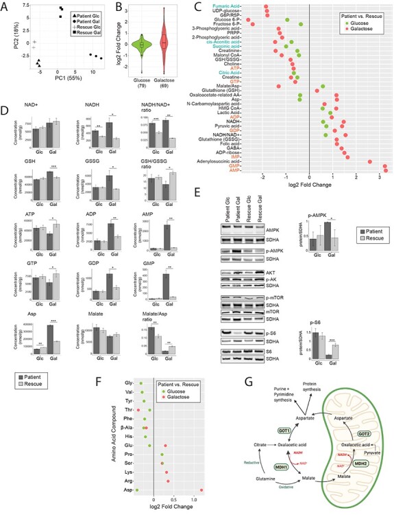
Figure 3 .

Metabolomic analysis reveals a high NADH/NAD+ ratio, which stalls the TCA cycle in patient cells. (A) Principal component analysis of the overall metabolomic profile. Symbols convey information about the four experimental groups and their three replicates. (B) Violin plot representing the distribution of the log2 fold change (patient/rescue) for all measured metabolites. Box plots indicate the median and the first and third quartile. The number of metabolites in each group is indicated in parentheses below the graph. ‘Glucose’ (green) represents the comparison of patient versus rescue cells in glucose. ‘Galactose’ (red) represents the comparison of patient versus rescue cells in galactose. (C) Dot plot representing the fold change of the most changed metabolites for each condition. Fold change is represented in log2 scale and the data show only metabolites with significant differences with a P-value <0.05. The P-value is computed by Welch’s test. Metabolites of nucleotides are highlighted in orange font and TCA cycle intermediates in blue font. ‘Glucose’ (green) represents the comparison of patient versus rescue cells in glucose. ‘Galactose’ (red) represents the comparison of patient versus rescue cells in galactose. (D) Bar plots representing the most significantly changed metabolites. Concentrations are depicted in nmol/g and ratios are pure ratios. Values for the patient cells are shown in dark grey and values for the rescue cells are shown in light grey. P-values were computed by Welch’s test, *P < 0.05, **P < 0.01, ***P < 0.001. (E) Immunoblot analysis of proteins involved in the mTOR pathway. Whole cell extracts from patient and rescue fibroblasts grown in glucose and galactose for 2 days were separated by SDS-PAGE and probed with antibodies against indicated proteins. SDHA was used as a loading control. Bar plot indicates the quantification of three and four immunoblot analyses for p-AMPK and p-S6, respectively, where patient is depicted in dark grey and rescue in light grey, *P < 0.05, **P < 0.01, ***P < 0.001. (F) Dot plot representing the fold change of the most changed amino acid levels for each condition. Fold change is represented in log2 scale and data show only metabolites with significant differences with a P-value <0.05. The P-value is computed by Welch’s test. ‘Glucose’ (green) represents the comparison of patient versus rescue cells in glucose. ‘Galactose’ (red) represents the comparison of patient versus rescue cells in galactose. (G) Graphical representation of enzymes and metabolites of the malate aspartate shuttle. Selected enzymes are shown in green boxes for cytosolic and mitochondrial processes. This scheme was created with BioRender.
