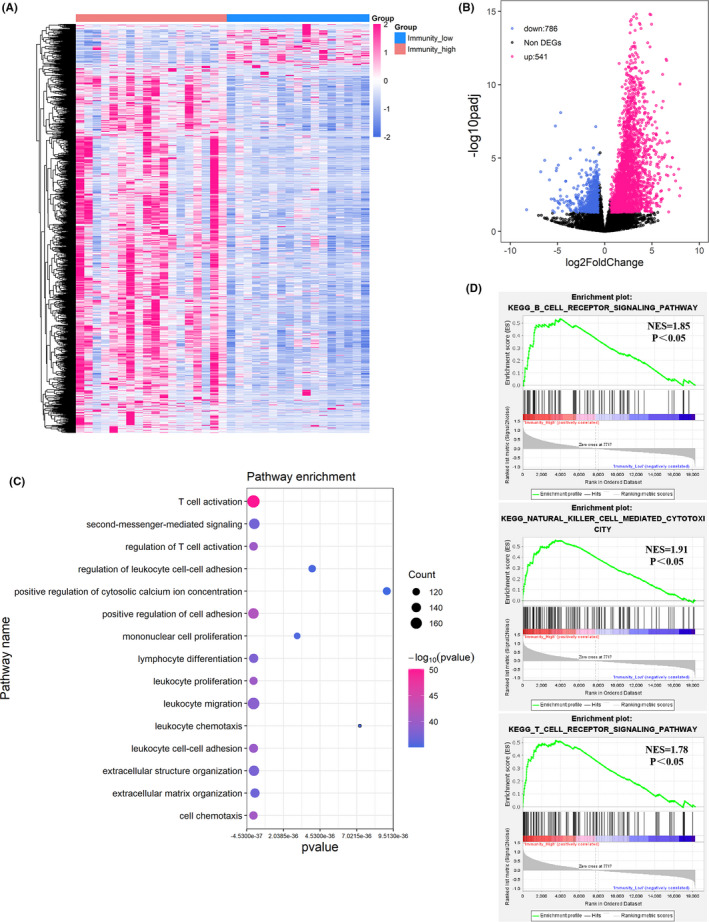
FIGURE 2.

Differentially expressed genes and enrichment analysis. A, Heatmap of the differentially expressed genes (DEGs) between the immunity‐high and immunity‐low groups. Samples (column) and genes (row) were clustered by unsupervised hierarchical cluster analysis. B, Volcano plot showed the DEGs between the immunity‐high and immunity‐low groups. Red dots represented the significantly upregulated genes in the immunity‐high group compared with immunity‐low group (Log2(foldchange)) >1.5 and adjusted p < 0.05). Blue dots represented the significantly downregulated genes in the immunity‐high group compared with immunity‐low group (Log2(foldchange)) <−1.5 and adjusted p < 0.05). Black dots represented non‐DEGs. C, Go‐bubble plot showed top 15 pathways of GO enrichment analysis, ranked by p value. D, Significant pathways identified by GSEA
