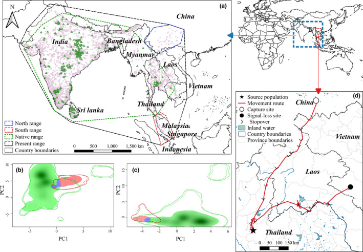
FIGURE 1.

Study ranges and population data in our niche analysis (a). Green triangles represent the native population. Pink points represent thinned data which include new north population within the blue polygon and new south population within the red polygon (a). Panels b and c plot of niche overlap by species in native range (green) and new range (red). Panel b compares the native population with north population; panel c compares the native population with the south population. Purple areas represent the overlapped niche among populations. Panel d shows that an Asian openbill in China can fly back to Thailand
