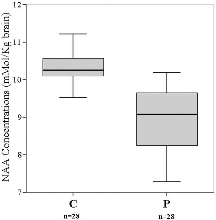
Fig 3.
The box-plot graph demonstrates the distribution of NAA concentrations around the median values of all patients (P) and of the control subjects (C). The horizontal lines dividing the boxes represent the median values. The upper and lower edges of the boxes represent the upper and lower quartiles (medians of the upper and lower 50% of the values), respectively. The vertical lines (whiskers) are 1.5 times the inner quartile spread in length, which is measured from the median.

