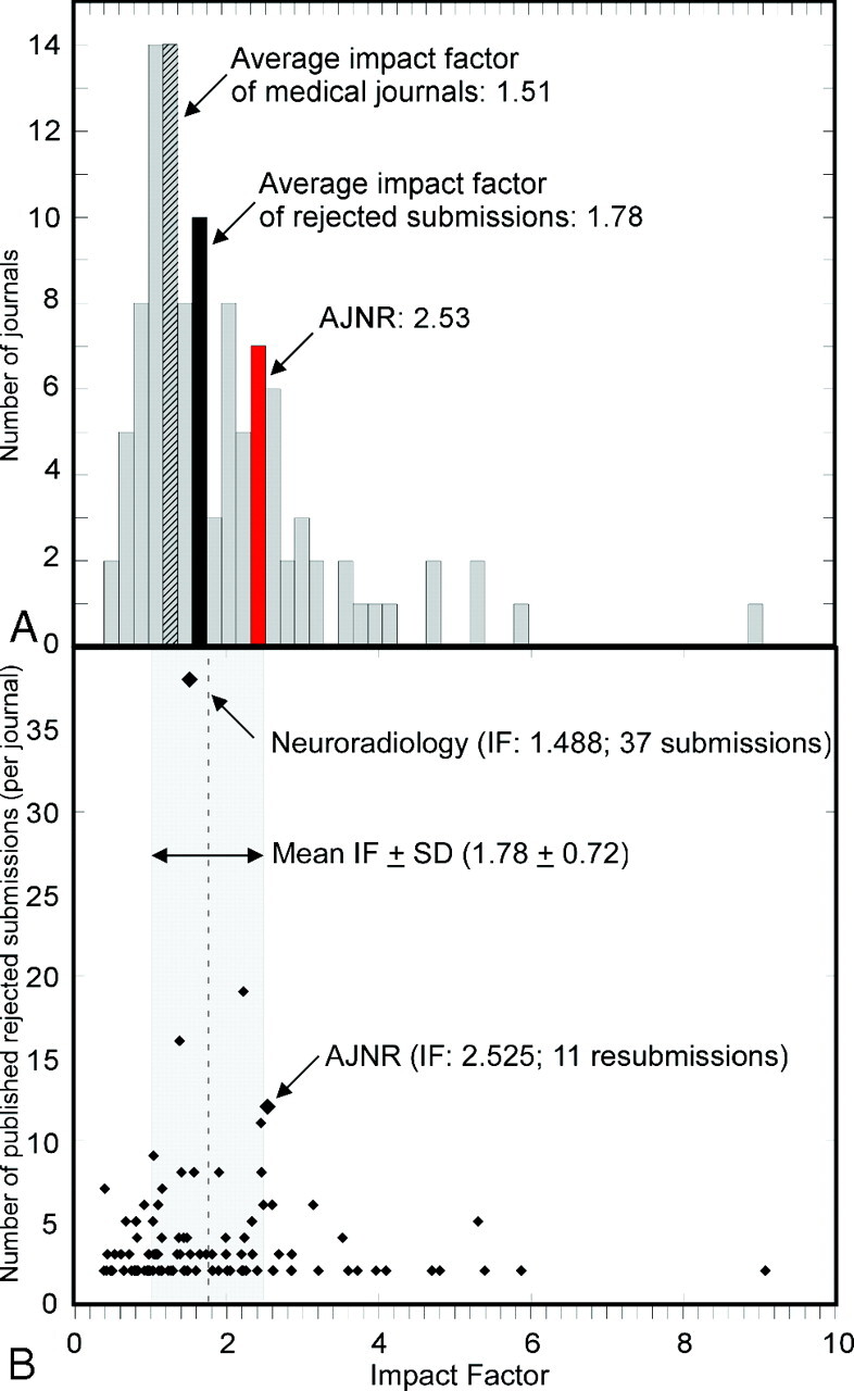
Fig 2.

Impact factor distribution of journals publishing rejected AJNR submissions. A, Impact factor distribution of journals publishing rejected AJNR submissions shown as a histogram, with each bin representing an impact factor range of 0.2. The journal AJNR is contained within the frequency distribution bin shown in red, whereas the average impact factor of all journals in this study would belong in the black bin and the average impact factor of all biomedical journals would belong in the gray and black bin. B, Impact factors of each journal (diamonds) shown as a function of the number of published submissions. Mean impact factor of all journals publishing rejected AJNR submissions (dashed vertical line) and SD (gray rectangle) are shown for reference.
