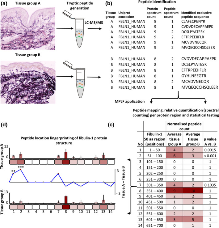
FIGURE 1.

Identification of regional peptide yield differences within proteins using peptide location fingerprinting. Proteins are first extracted from tissues of interest using study‐specific protocols and trypsin digested (a). Post LC‐MS/MS, exclusive tryptic peptide sequences are identified and counted (spectral counting, i.e. peptide spectrum matches; PSMs) per tissue sample. Fibulin‐1 is shown here as an exemplar (b). Peptide count reports are uploaded to MPLF (c) where protein structures are divided either into user‐defined amino acid (aa) step sizes (e.g. 50 aa shown here) or into step sizes corresponding to domains, repeats or regions pre‐defined by the UniProt database. Peptides and their counts are then mapped to their protein regions and summed. Sample‐specific regional counts are normalised across the experiment based on the median protein spectrum count, averaged per tissue group and statistically compared (Bonferroni‐corrected repeated measures ANOVA). This analysis is then visualised using representative aa‐scale schematics of each protein (d). Average peptide counts are heat mapped to their corresponding region for comparison between groups (bar graphs). Regional, average peptide counts in one tissue group are subtracted from the counts of the other to show regional differences in peptide yield (line graph) with statistical significances indicated (** ≤0.01, *** ≤0.001)
