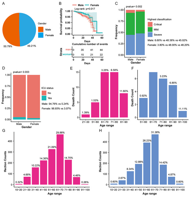
Figure 1.

The distribution of infection and mortality of 3044 COVID-19 patients of different genders. (A) The pie chart shows the overall infection rate of patients of different genders. (B) The overall survival rate curve shows the survival rate of patients during the treatment of different genders. (C) Stacked histogram shows the highest disease classification ratio of patients of different genders. (D) Stacked histogram shows the proportion of ICU admissions of patients of different genders. (E) The histogram shows the mortality of males in different age groups. (F) The histogram shows that the mortality rate of females in different age groups. (G) The histogram shows the infection rate of males at different ages. (H) The histogram shows the infection rate of females in different age groups.
