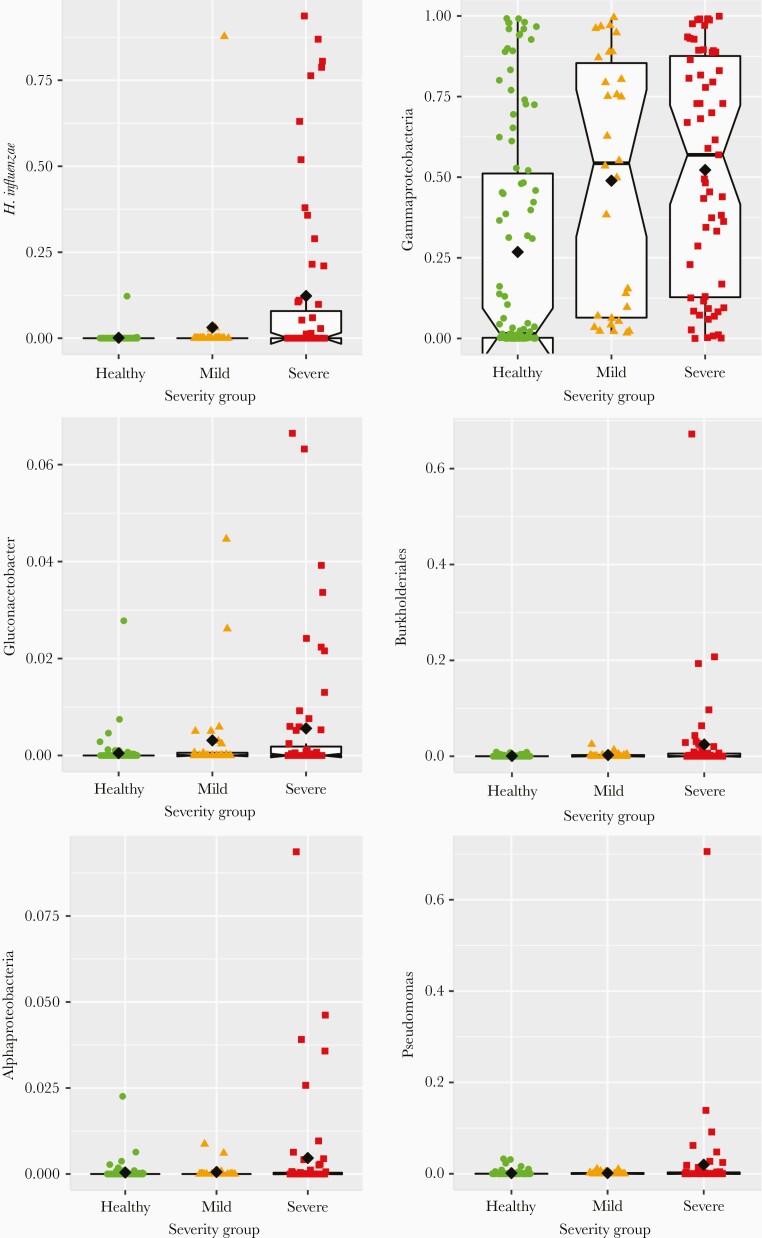
Figure 3.
Relative abundances (y-axes) of select taxa significantly associated with more severe disease in the cross-sectional cohort, with samples grouped by dichotomizing illness based on severity into mild and severe groups (x-axes), using a severity score threshold of 3.5. Each colored point represents the relative abundance of a given taxon in a single individual, with columns (left to right), shapes (circle, triangle, square), and colors (green, orange, red) distinguishing between healthy, mild illness, and severe illness groups, respectively. The black diamonds indicate the group mean for each group. Box plots are overlaid on each group, centered on the group median, with notches indicating an approximately 95% confidence interval, boxes indicating boundaries of the first and third quartiles, and whiskers extending to the largest and smallest values no further than 1.5 × interquartile range from the boxes. Points beyond the whiskers are commonly considered outliers, which in this case would suggest that many of the observed associations between taxon relative abundance and illness severity are driven primarily by outliers, or that taxon abundance in severely ill infants comprises more than 1 underlying distribution.

