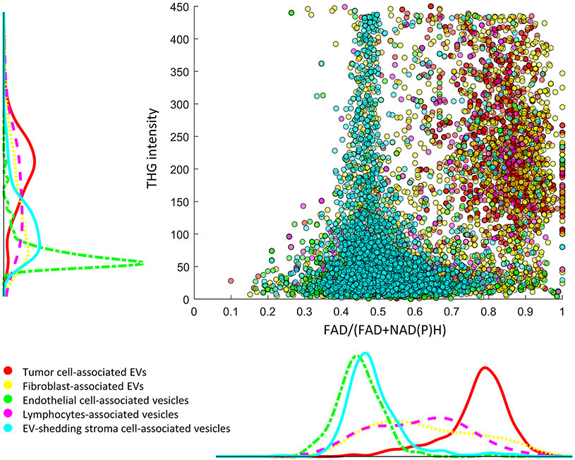
Figure 6. Mapping of individual EV properties in relation to their cell neighbors.
Each dot corresponds to one EV, with the color indicating their spatial origin. For instance, for EVs that are adjacent to tumor cells, they are shown as red dots in the scatterplot and their intensity distribution is shown as the red curve in the histogram plot that is parallel to the axis, with the vertical plot corresponding to THG intensity and the lateral plot corresponding to FAD/(FAD+NAD(P)H) values. For interpretation, the density of datapoints along one dimension in the scatterplot corresponds to the distribution height of the histograms.

