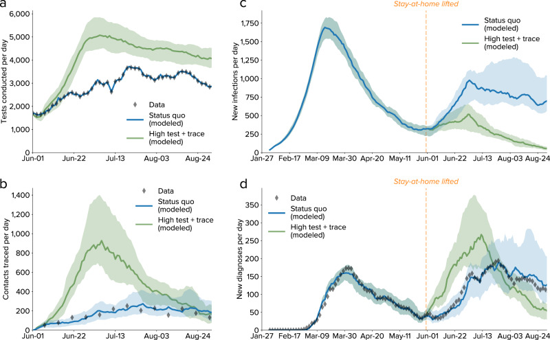
Fig. 5. Comparison between observed epidemic trends and projected scenarios from 1 June to 31 August 2020.
a Number of tests conducted per day, with modeled values for the status quo (using the data as an input) and a counterfactual scenario with high testing and high tracing. b Number of contacts traced per day. c Estimated number of new infections, with a significant rise in infections observed shortly after the stay-at-home order was lifted. d Number of diagnoses per day, showing consistency between the model and the data both for the calibrated period (27 January–31 May 2020) and the projected period (1 June–31 August 2020). In all panels, lines show medians, and shaded regions show 80% confidence intervals.

