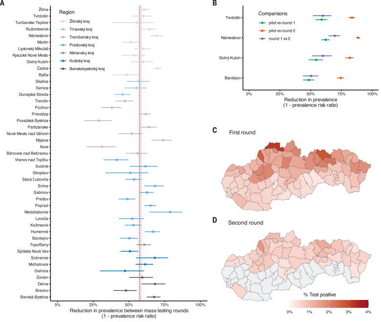
Fig. 2. The change in test positivity between mass testing campaigns.
(A) Change in test positivity [1 crude prevalence ratio (cPR)] observed from mass testing round 1 to round 2 in the 45 counties that were eligible for both rounds of mass testing. Counties are grouped and color coded into regions. The crude pooled estimate and its 95% confidence bounds are shown as red vertical lines. The confidence intervals were estimated using a normal approximation (Wald interval). (B) Change in test positivity (1 cPR) observed from the pilot mass testing round to either the first (green) or the second (orange) national round and from the first to the second mass testing round (blue) in the four counties that were included in the pilot. The confidence intervals were estimated using a normal approximation (Wald interval). (C and D) County-level test positivity in the (C) first and (D) second round of mass testing. Gray areas indicate counties that were not part of the second round because their test positivity rate was less than 7 per 1000 and hence have no estimates.

