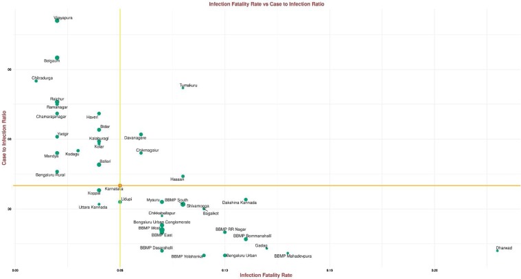
Figure 2.
Scatter plot of CIR versus IFR. The size of the point indicates the IgG prevalence in the units.
The horizontal and the vertical lines intersect at Karnataka’s IFR and CIR. Moving clockwise from the upper-left quadrant: a unit with a larger green disk had high IgG antibody prevalence, low IFR and high CIR, such a unit was missing cases and deaths; a unit with a larger green disk in the upper-right quadrant had high IgG antibody prevalence, high IFR and high CIR, such a unit was also likely missing cases but death reporting was better than average; a unit with a larger green disk in the bottom-right quadrant had high IgG antibody prevalence, high IFR and low CIR, such a unit did well in identifying cases and had better-than-average reporting of deaths; a unit with a larger green disk in the bottom left had low IFR and low CIR, such a unit saw a surge in cases but did well in identifying cases and had low fatality rates, perhaps due to good clinical practices that could be studied and replicated elsewhere.

