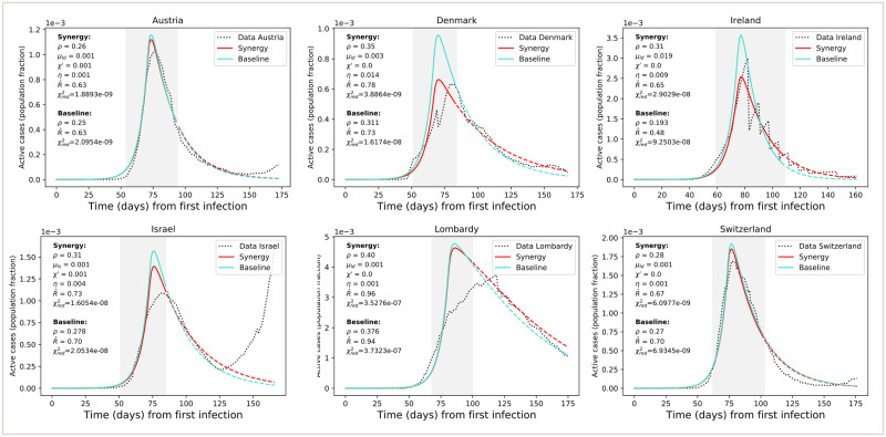
Fig 9. Results of model fitting.
Results of model fitting. Infection curves for the considered countries (dotted) are fitted with the SPQEIR model with appropriate parameters (red curves). We also show a comparison with the fitted curve obtained from the “basic” SEIR model with only social distancing (turquoise curves). Parameter values are reported for each country, as well as the corresponding (for the grey area, following Eq 1) and . The period of measures enforcement, from tm to tp, is highlighted by the grey region. Time progresses from the estimated day of first infection t0 (cf. Table 3). Population fraction refers to country-specific populations (cf. Table 1). After phase-out, we prolong the fitted curve (parameter values unchanged) to compare observed data with what could have been if measures had not been lifted (dashed lines). From the data, we can observe a resurgence of cases that points to possible “second outbreaks” (particularly in Israel).

