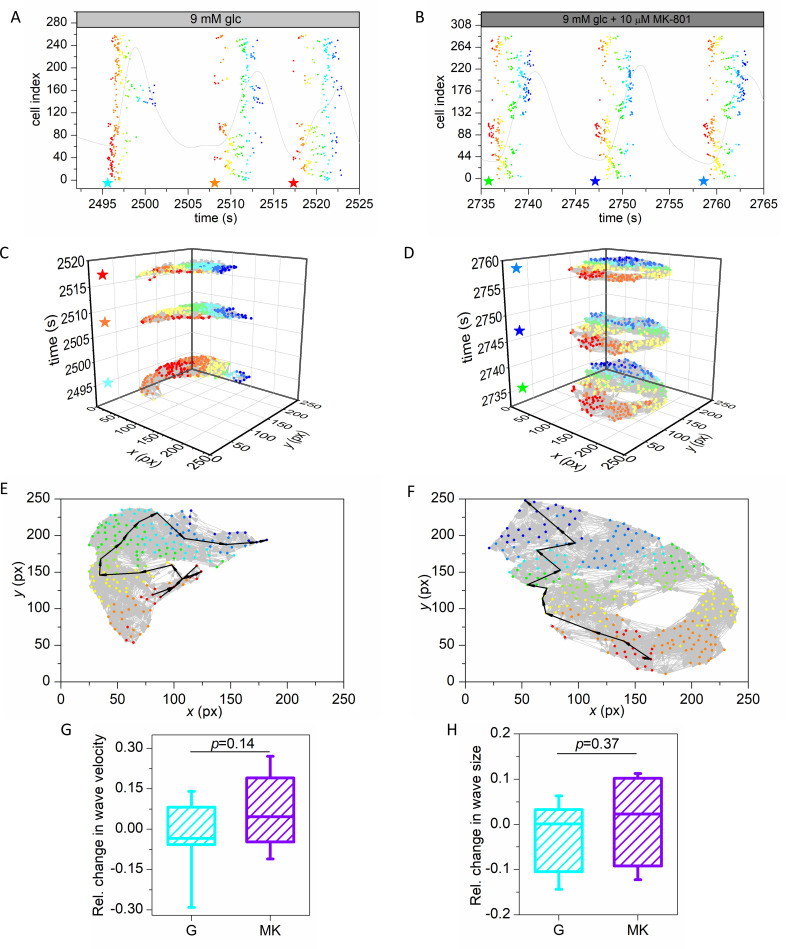
Fig 3. Multilayer network representation of calcium wave propagation in the pancreatic islets.
Raster plot of activation times of cells for three detected calcium waves for a recording in protocol G (A), and a recording in protocol MK (B). Stars indicate the start times of waves and dots indicate the activation times of individual cells which participated in the wave. Colors of dots represent the activation times of cells within the individual wave, with red indicating initiator(s) and blue the cell(s) that activated last. Light grey curve represents the mean field calcium signal. Panels (C) and (D) are multilayer network representations of detected waves for the G and MK protocol, respectively. Stars indicate the start time of individual waves. Color coding is the same as in panels (A) and (B). Panels (E) and (F) show individual waves from a recording in the G and MK protocol, respectively. Light grey arrows are directed weighted connections between cells and the black bold arrows show the shortest paths from the initiator(s) to the cell(s) that activated last in the wave. Weights are the time delays between cells. Color coding is the same as in panels (A) and (B). Panels (G) and (F) show the relative change in wave velocity and relative wave size, from interval 1 to interval 2 for protocol G (cyan) and protocol MK (violet). Box-plots are defined the same as in Fig 2. Data were pooled from the following number of mice/cells/islets: 3/1280/9 (protocol G), 5/1622/11 (protocol MK). p–significance level. Statistical test: Student’s t-test (G, H).

