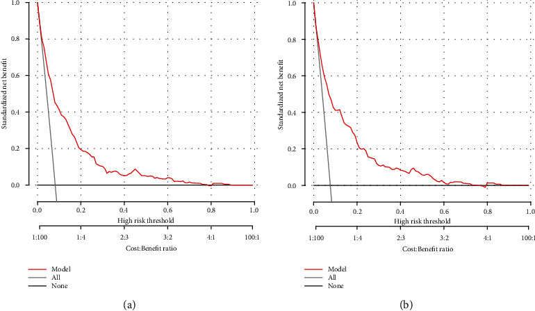
Figure 7.

Decision curve analysis of the nomogram in the training (a) and validation cohorts (b). The y-axis stands the net benefit. The x-axis indicates the threshold probability. The red line represents the nomogram. The black line displays the net benefit of the strategy of treating no patients. The gray line displays the net benefit of the strategy of treating all patients (bootstrap resampling times = 1000).
