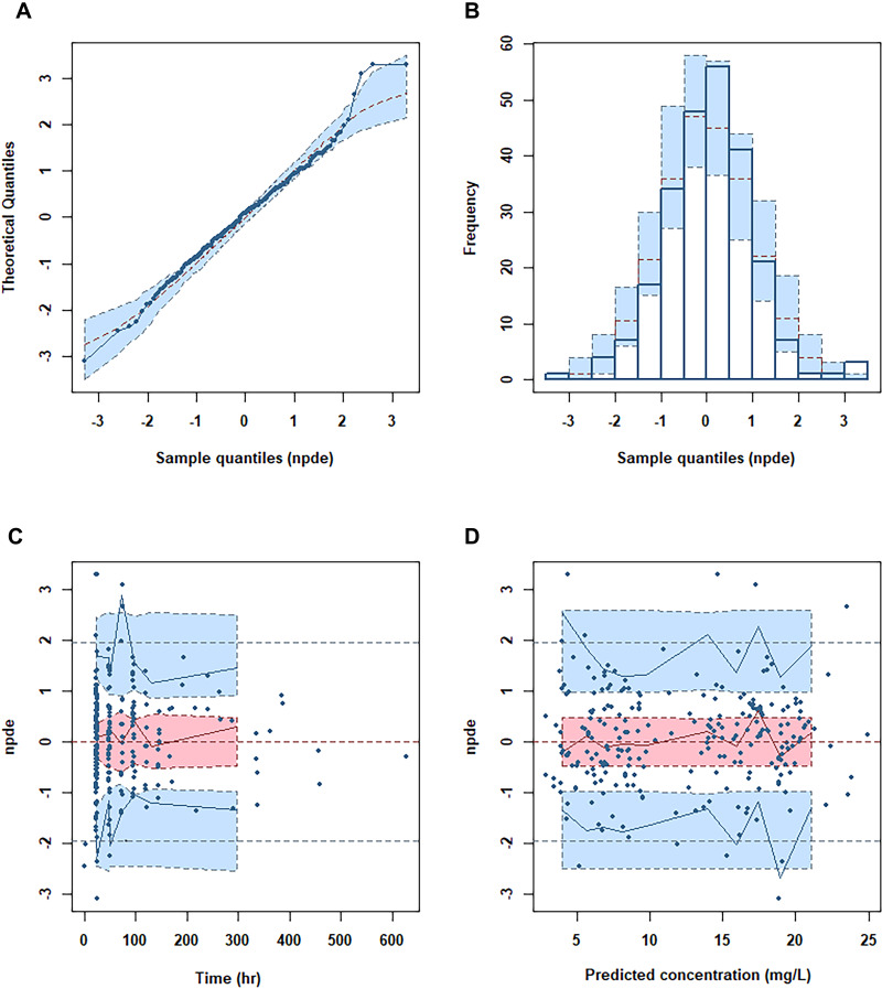
Figure 3.
Normalized prediction distribution error (NPDE) metrics for the final PK model.
Notes: (A) Quantile-quantile plot of NPDE. (B) Distribution of NPDE. (C) NPDE versus time. (D) NPDE versus predicted concentrations. The observed concentrations were shown as filled circles, and solid lines represented the 5th, 50th and 95th percentiles of observed data. Red or blue shaded areas represent the 95% prediction interval.

