
Figure 3:
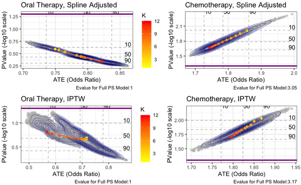
Visualized Sensitivity Analysis
Four sensitivity analyses for four ATE estimates are shown. Contours over scatterplot show the entire distribution of ATE and associated p-values for the set of plausible propensity score models. Dashed lines show denoted percentiles cutoffs for this distribution. K denotes number of covariates in shown model, and the dotted line plot shows median ATE and p-value for each set of K covariates from K=1 to K=12. Thick solid line indicates significance threshold of alpha=0.05. E-values for the full model (K=12) are listed in caption.