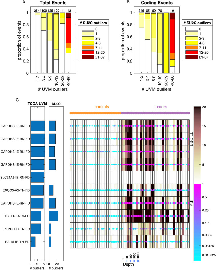
Figure 6.
Common melanoma associated splice events are shared between cohorts. (A) Comparison of number tumors meeting outlier criteria between cohorts. Along the x-axis, events are binned by the number of tumors meeting the outlier threshold in the TCGA cohort. The total number of events in each bin is indicated at the top of each bar. Within each bar, the events are binned by the total number of tumors meeting the outlier threshold in the SU2C cohort, and the proportion of events in each bin is indicated by the color. (B) Same as (A) but only including events with predicted protein coding changes. (C) Heatmap of the data in the SU2C cohort for the 10 events with predicted coding sequence changes that are found in more than 20 tumors in the TCGA cohort. Each row is an event and each column is a sample, with the controls on the left and the tumors on the right. The color of each dot represents the PSI and the size of each dot represents the coverage at the event. The shading behind the dot indicates the Bisbee outlier score. The bar graphs to the left of the heatmap indicate the number of tumors meeting the outlier threshold in each cohort. The labels on the left indicate the gene name, event type (IE—intron exclusion, A5—alternative 5′, IR—intron retention), and the effect type (RN-FD—frame disruption in the control samples predicted to result in novel sequences, TN-FD frame disruption in the tumor samples predicted to result in novel sequences).

