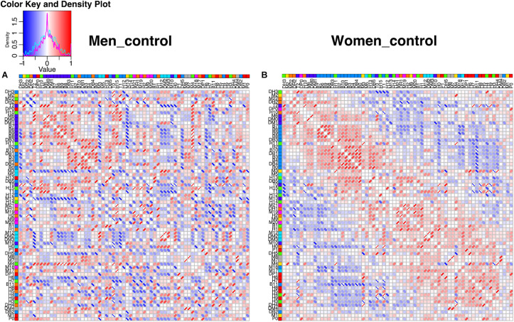
FIGURE 5.
Unfiltered correlation matrix of men and women. Spearman correlation matrices are shown as heatmaps for men (A) and women (B). The density plot for the correlations is presented in the upper left side, for men (cyan) and for women (magenta). Columns and rows are ordered according to the angular order of the eigenvectors of women matrix. The network clustering is shown in colors to the right of the labels of the physiological variables. Spearman correlations are presented as ellipses. Positive correlations are shown in shades of red while negative correlations are shown in shades of blue.

