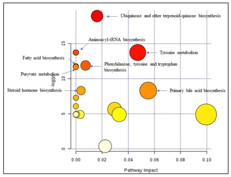
Figure 6.
Summary of the pathway analysis with MetPA where all the metabolites were considered. The area of the bubbles is proportional to the effect of each pathway, with color denoting the significance from highest in red circles to the lowest in white circles. The red circles represents pathways with the highest p-value (<<0.0001), the orange circles represents pathways with p-value below 0.05, yellow circles represent pathways with p-value close to 0.05 and white circles represent pathways with p-value > 0.05.

